Here is my final "Reflections of Lincoln" post. I thought it was pretty clever, and Abe looks pretty babelicious. It was sort of a struggle to make the picture interesting enough for...ahem...some people (RUSTY!!!!!) , but I'm happy with the way it turned out :) The American flag reflection in his glasses brings more interest to the piece and plays more off of the reflection title.
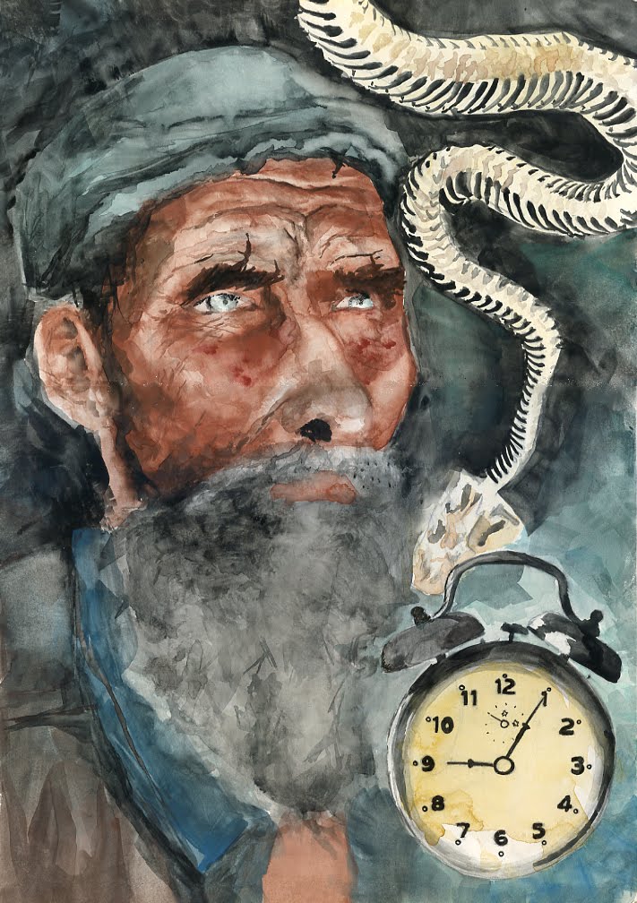
Here I've got my redone memory portrait airbrush, and I've also got my "Number 11" assignment. For this one, we had to portray the number 11 in any method we wanted, using the media we had previously been taught. I chose to do a guy with really huge teeth (they look like number 11) and I used watercolor and ink. I think he turned out hideously awesome.
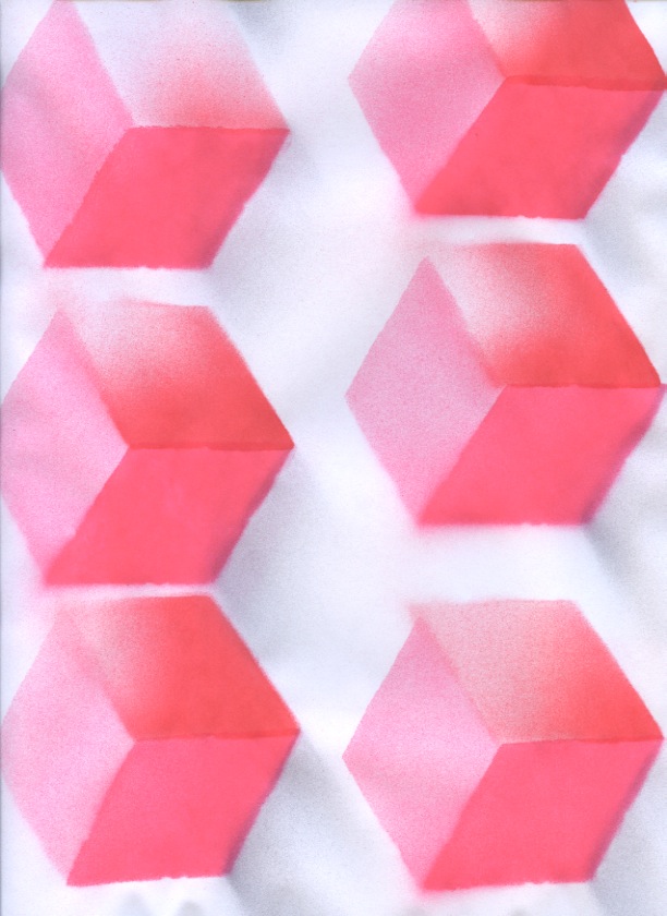
We've been doing airbrush lately, and it's sort of a disaster but I think I've taken to it pretty well. There are some practice exercises with cubes and spheres, and then my first attempt at a caricature. The caricature is supposed to be a portrait done from memory of someone we know, so I tried to do my cousin Kristin. Don't worry, I'm doing it again, and this time not entirely out of airbrush.
For this assignment we had to illustrate a post card for our home state, but it couldn't be something that's been overdone. Being from Missouri, I decided to do a toasted ravioli. STL BABY! This was done in watercolor I believe.
I do not like this. This is a technique where we have to paint large blocks of color and then pick it out again so it's lighter. I suck at it. For these pics we had to do a montage of three images. I'd say my most successful is the old dude but that one still needs work. Otherwise i have a horse with a lime and a fence, and a duck with a cupcake and balloons. I think there are elements of each one that are good but most of the stuff needs work. oy vey.
So I chose my bluebird, my rhino, my creepy girl, a boot, and my dog line art. I'd say it shows a little bit of versatility in technique, color, and compositions, and I think all of them are pleasing to look at. My favorite is probably the creepy girl or the boot. The boot is awesome because it was just really loose and turned out to be cool looking. On the girl I like her eyes. The dog is fun because it shows conceptualization (it goes with an article about a neuroscientist studying dog brains) and it's pretty clean. My rhino is a fun example of texture, and the bluebird shows a fun use of simple colors and value. Basically, I'm awesome. :-P
This is an absurdly large watercolor I did. It's basically a scary girl with a LOT of freckles. I had to go over her color like 5 times to make her look good enough, and I splattered her colors. My favorite part is probably her eyes. The hair was a nightmare. We don't talk about that.
We had to create an illustration of a product and an illustration to go with an article in the newspaper, so I chose a bottle of perfume for my product, and an article about a neuroscientist researching dogs, the illustration for which is a dog with a phrenology brain illustration. I like the way these turned out. The perfume could probably be a little tighter, that's difficult to do with watercolor! I think the dog illustration turned out to be cute.
For this one, we had to take an image and paint it ten times differently. We were allowed to crop, paint in different colors, or different styles. Pretty flexible. I chose to just change the colors to practice with that aspect of watercolor. I painted ten colorful birds. For the other part of the assignment we just had to do abstracts of different color schemes. I did harmonious colors, meaning five colors that are next to each other in a color wheel. I am only showing the front five because the back ones are ugly.
Ok I haven't blogged in a while, so I have a buttload of stuff! yay! I have 2 larger paintings, architecture and "critter." For those I have a bridge and a rhino, and I'd say the rhino is probably a little more acceptable. I also painted a self-portrait, but it's a horror to behold. I'll spare everyone. We've been painting ten watercolors for each class period, and as of today I've done thirty of the small paintings. I chose several of them to post, and these are somewhat decent. Some are fruits, some are "things with sides," and some are just whatever I felt like doing. Yay!
So we had to do 3 illustrations incorporating using paint as line, and I didn't like it. My lines in these pics look weird and forced, I just like the large blocks of color much better. These are all pretty mediocre, so hopefully I just get better and can forget about these :P Be on the lookout for a flood of watercolors soon.
Here's the cute kitty I illustrated today in class. We used only watercolor, no pen. We used different brushes to imply line. I didn't really use much line, because kitties are very furry. I think it turned out pretty well for being done during class :)
Okay, here's the refined versions of the toilet and monkey. They turned out okay, could be better, could be worse. I'd like a little more darkness in the monkey, but when it comes to large blocks of black, Microns are not my friend. So I only did a little bit of the solid black blocks. That illustration took about an hour or so, and the toilet took about ten minutes :P
For our first water color exercise, we had to take our refined larger line illustration and apply a wash to it. i chose purple and flesh tone, and it didn't turn out beautifully, but it's okay. I am learning :D
For this round, we were told to just take pictures of everyday stuff that we run in to, and then draw them in any style of line art. We were allowed to use the same style for every photo, if we so chose. Most of mine were pretty simplistic lines, like contour drawings. Some of them were black and white using negative space for definition. We now have to redo 2 of them at a larger size, and I'm redoing the monkey and the toilet.